Adding Tables and Making Them Responsive
Lauren Blais (Unlicensed)
Laura P Rowan
Stephanie Lynn
This is an advanced topic. You will need to possess a good understanding of HTML, and have significant experience with Drupal content editing.
Overview
You can add tables and, if you like, make those tables responsive in content on Drupal 10. This ensures they look good no matter how small a device someone viewing your site uses.
As this requires going into the "source" of your text editor and working with html, it is more of an advanced topic for our content editors.
The first part covers how to make a table. The second will explain how to add classes to make your table responsive.
Note on the Screenshots in this Document
This document shows screenshots from a site using the Franklin Gold Theme.

Table of Contents
Notes for the Web Team (Developers)
In order for this to work for our clients, you need the following fields allowed under the filter settings for the Full HTML text format:
<table class> <caption> <tbody> <thead> <tfoot> <th class> <td class style colspan rowspan> <tr>
*The style and colspan/rowspan are what users need to merge columns and rows

Web team members will also need to ensure the theme has the correct css. This is already available for the Franklin Vertical and Franklin Bold themes.
You can also find it in the tables.css of the Bartik theme.
/**
 * Responsive tables.
 */
@media screen and (max-width: 600px) {
 th.priority-low,
 td.priority-low,
 th.priority-medium,
 td.priority-medium {
 display: none;
 }
}
@media screen and (max-width: 960px) {
 th.priority-low,
 td.priority-low {
 display: none;
 }
}
Steps
Part One: Create a table in the text editor region of your content
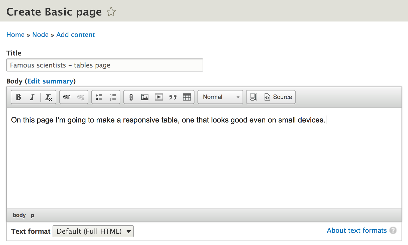
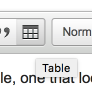
1) Within the text editor region of a piece of content, look for the table icon.
2) Decide how many rows and columns you need. You can always add more later.
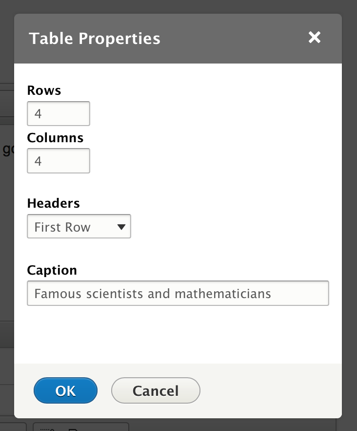
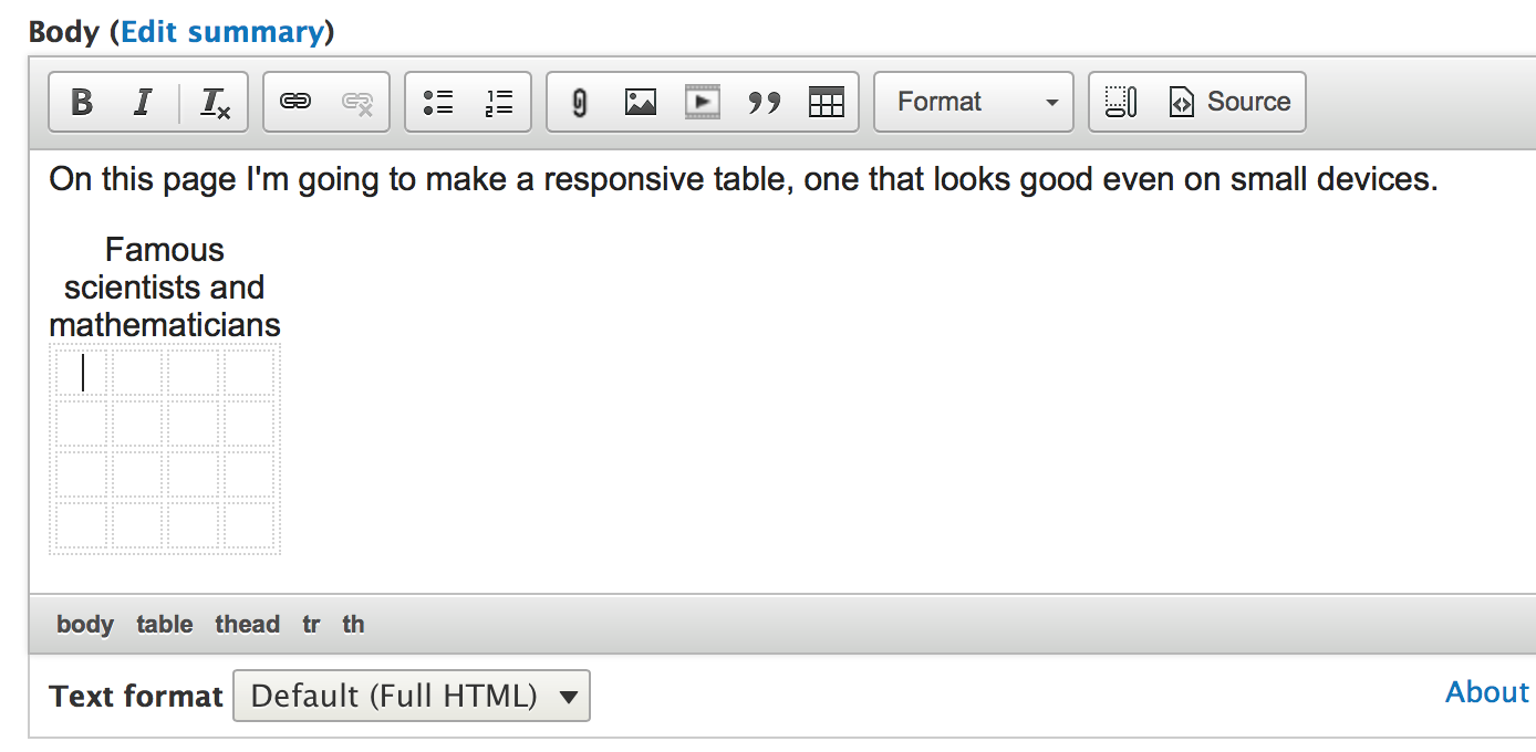
3) Indicate where your table header will be ("First Row" in the above example, and provide a caption.
Here's your table:
4) Type your content into the cells
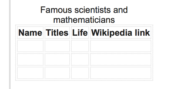
5) If you need to add another cell or row, right click on the table and select the option that meets your needs.
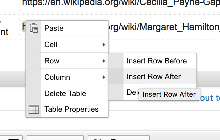
Here's my table filled out:
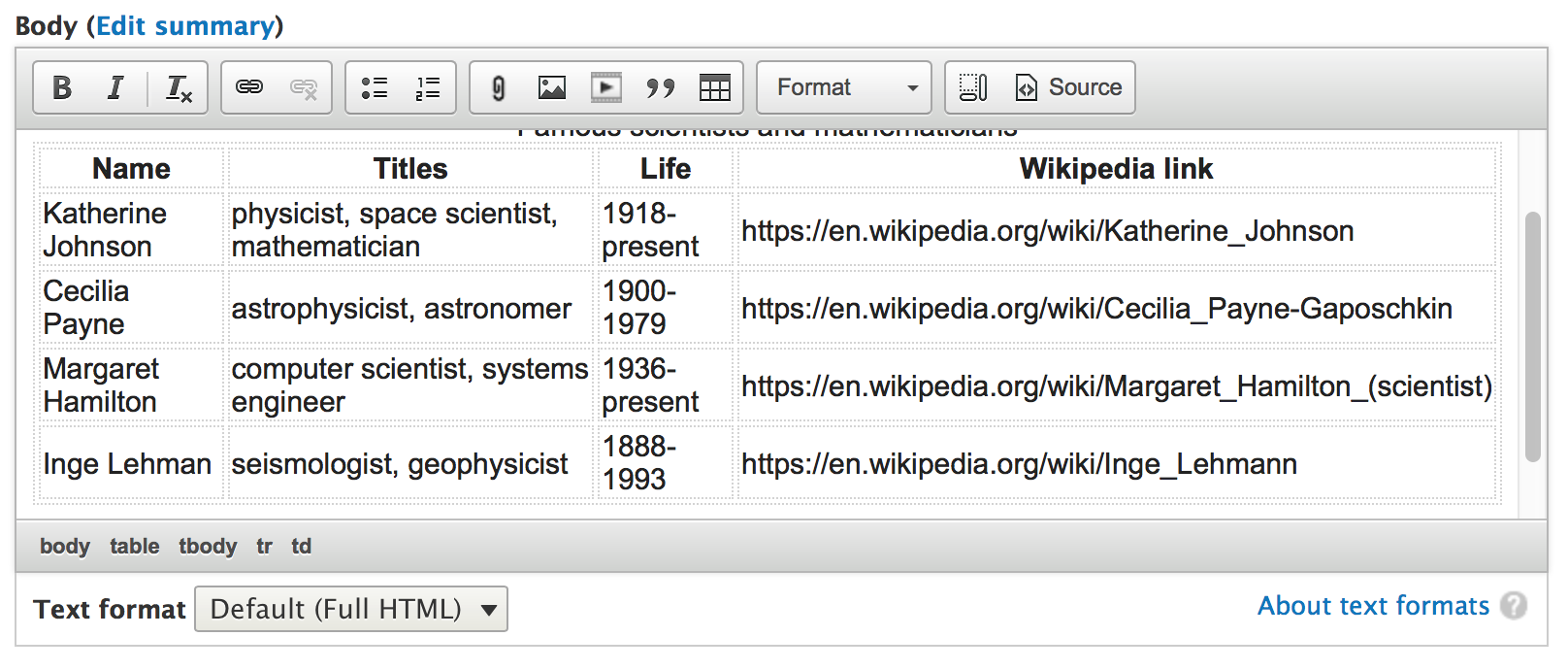
Merging cells
Note: If you are trying to merge rows or columns in a table and find you cannot, please put in a ticket to helpdesk.franklin.uga.edu.
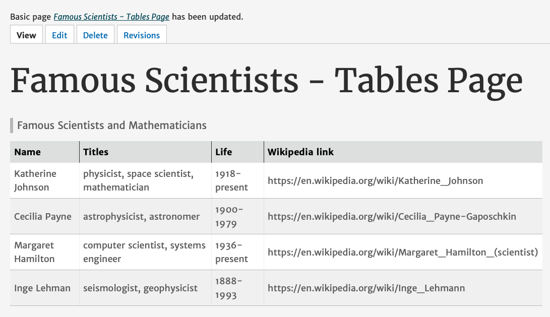
6) Save your content and view your table.

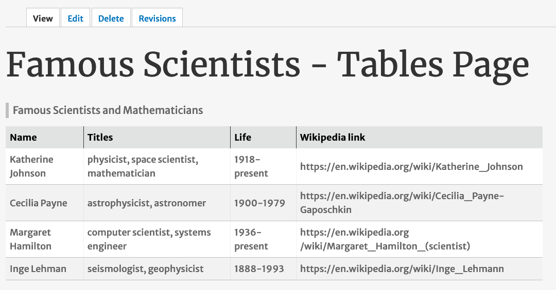
Notice the table has some flexibility, but the content doesn't all fit when I downsize the screen to simulate a cell phone screen.
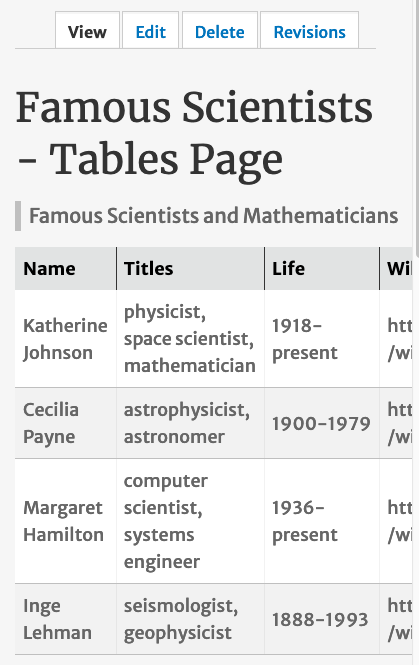
We're going to go into the source and add some responsive classes to our table using html.
Part Two: In the source of your text editor, add classes to the table rows and cells
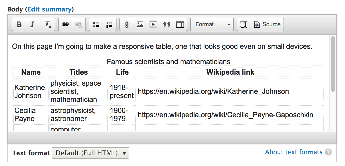
1) Click on the Source button of your text editor
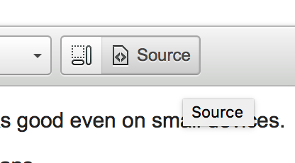
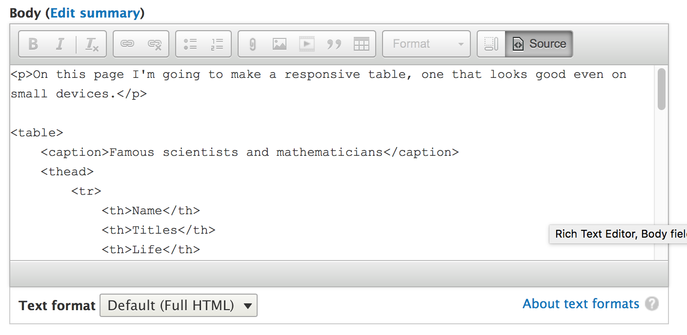
2) Add a class to the table to make it responsive.

To <table> I added <table class="responsive-table">.
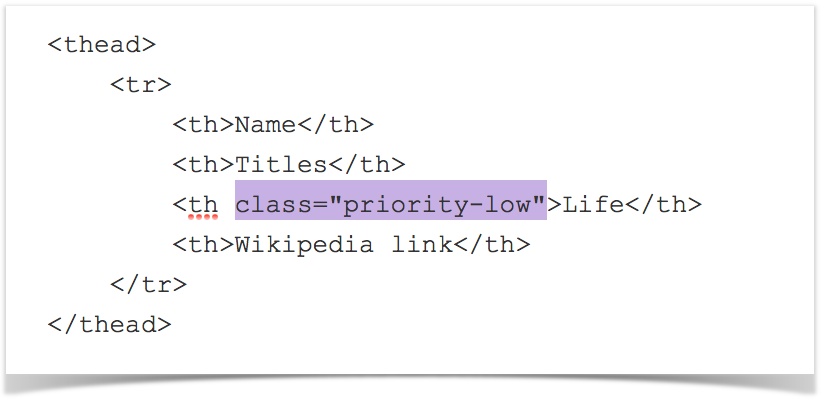
3) Decide which column or columns have the least priority and add "priority-low" classes to them.
These will be the first to disappear when the screen size shrinks.
Add the "priority-low" class to the table header row and each of the cells.
I'm making the Year column disappear first.
First, to <th> I added <th class="priority-low"> to make the header row Year disappear first.
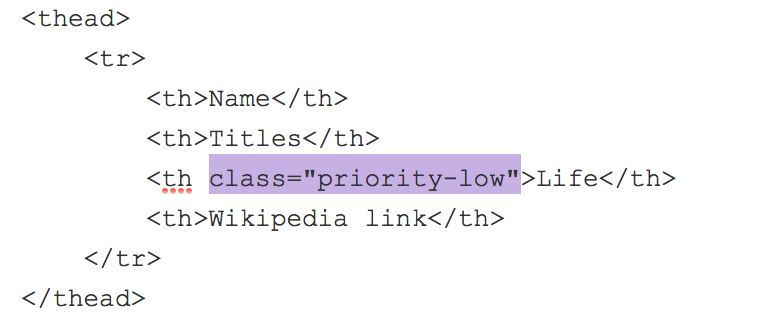
Next I changed <tr> to <tr class="priority-low"> to each of the Year cells.

I had to remember to add this class to all of the Years for each person in my table.
Note: To see all the changes made to the HTML of this table, please see my source code at the bottom of this document.
I won't see a change when I go back to the regular text editor mode away from the Source. I'll need to save my content first.

Save your page and test your results.
The Year column, which I gave the "priority-low" class, disappears once I decrease the size of the page.
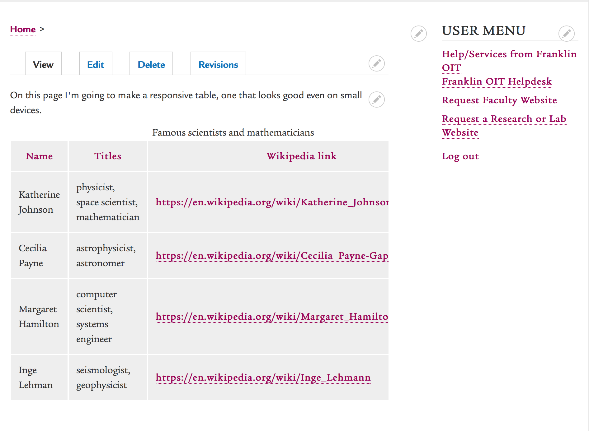
4) Decide which column or columns have second least priority and add "priority-medium" classes to them.
These will columns will not show up on the smallest devices.
Edit your page again and select the Source button once more.

Add the "priority-medium" class to the table header row and each of the cells.
I'm making the Title column disappear next.
First I change the table header...

Then I do each of the individual title cells.

Don't forget to change them all!
Note: Again, to see all the changes made to the HTML of this table, please see my source code at the bottom of this document.
Save your page and test your results.
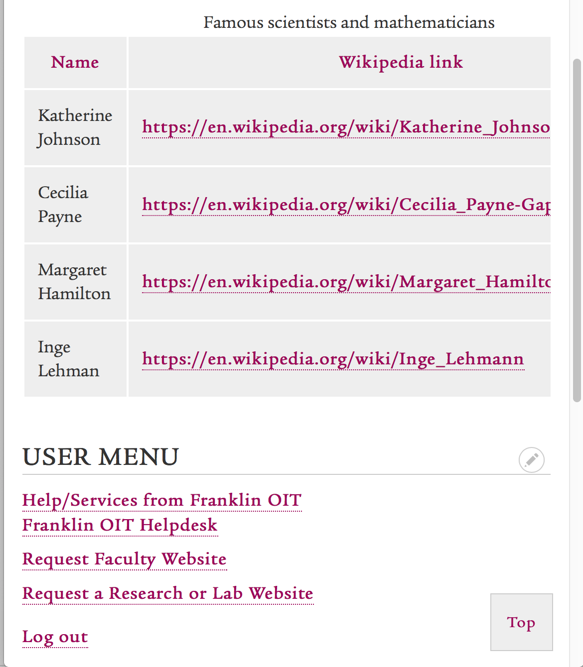
Now the titles won't show up on small devices.
But there's a problem.
The urls in the Wikipedia page columns are so long, and they don't have a word break so the text won't wrap.

Because pasting the url as the link text doesn't meet accessibility guidelines any way, I'm going to recreate the link with some friendly text.
5) Edit your table as needed.
I'm changing the link text for this Wikipedia page column.
For more about adding links, please view the Adding Links to Content document.


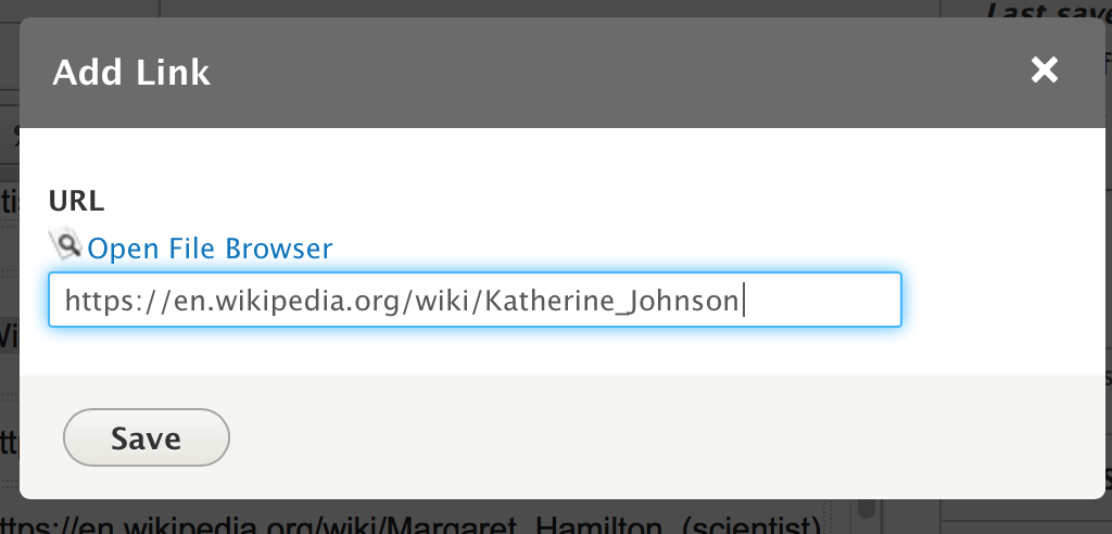
I did this for each link.
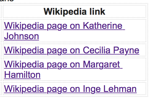
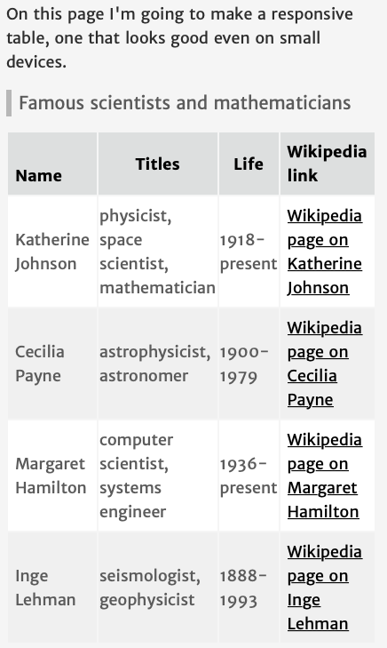
Notice I'm not just typing "Wikipedia page" over and over again, because that alone is not specific enough for link text. So I say "Wikipedia page for Katherine Johnson."

I saved my page.
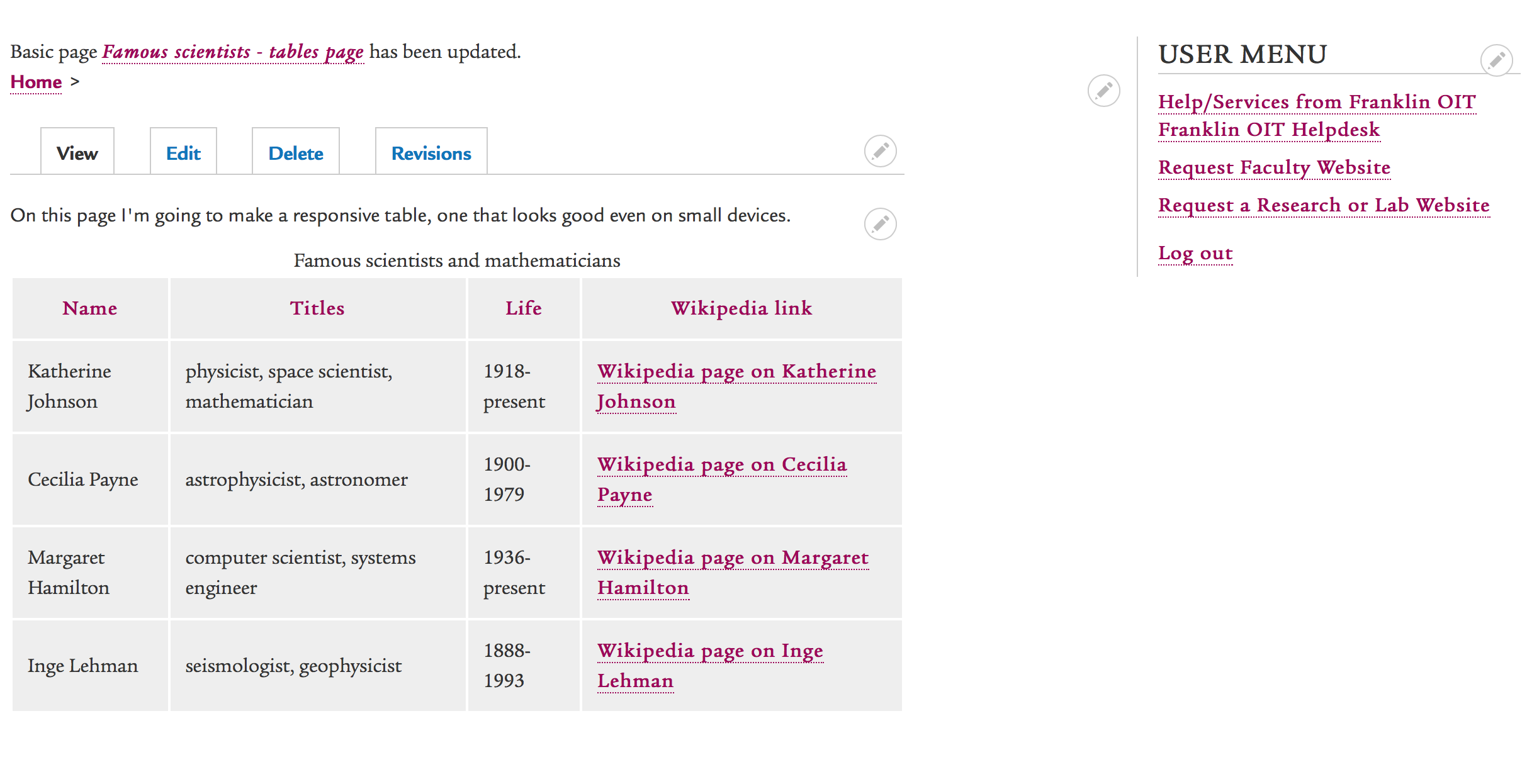
Looks good!
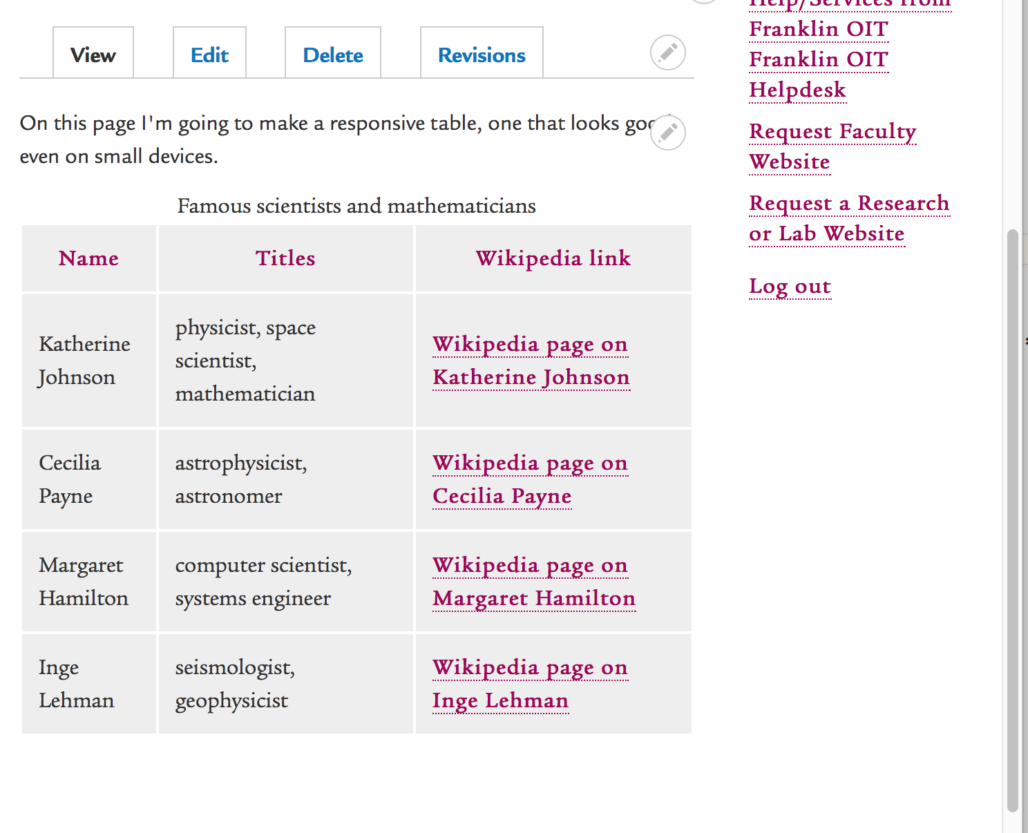
Still looks good!
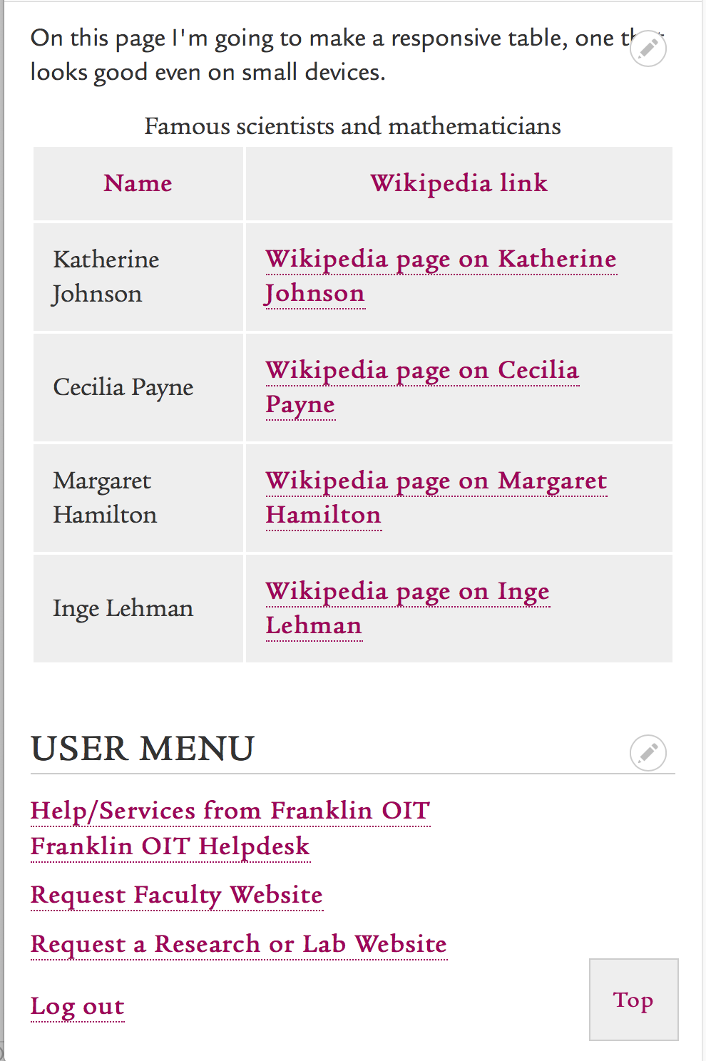
Source code before and after
Table source code before responsive classes were added:
<table>
 <caption>Famous scientists and mathematicians</caption>
 <thead>
 <tr>
 <th>Name</th>
 <th>Titles</th>
 <th>Life</th>
 <th>Wikipedia link</th>
 </tr>
 </thead>
 <tbody>
 <tr>
 <td>Katherine Johnson</td>
 <td>physicist, space scientist, mathematician</td>
 <td>1918-present</td>
 <td>https://en.wikipedia.org/wiki/Katherine_Johnson</td>
 </tr>
 <tr>
 <td>Cecilia Payne</td>
 <td>astrophysicist, astronomer</td>
 <td>1900-1979</td>
 <td>https://en.wikipedia.org/wiki/Cecilia_Payne-Gaposchkin</td>
 </tr>
 <tr>
 <td>Margaret Hamilton</td>
 <td>computer scientist, systems engineer</td>
 <td>1936-present</td>
 <td>https://en.wikipedia.org/wiki/Margaret_Hamilton_(scientist)</td>
 </tr>
 <tr>
 <td>Inge Lehman</td>
 <td>seismologist, geophysicist</td>
 <td>1888-1993</td>
 <td>https://en.wikipedia.org/wiki/Inge_Lehmann</td>
 </tr>
 </tbody>
</table>
Table source code after responsive classes:
<table class="responsive-table">
 <caption>Famous scientists and mathematicians</caption>
 <thead>
 <tr>
 <th>Name</th>
 <th class="priority-medium">Titles</th>
 <th class="priority-low">Life</th>
 <th>Wikipedia link</th>
 </tr>
 </thead>
 <tbody>
 <tr>
 <td>Katherine Johnson</td>
 <td class="priority-medium">physicist, space scientist, mathematician</td>
 <td class="priority-low">1918-present</td>
 <td><a href="https://en.wikipedia.org/wiki/Katherine_Johnson">Wikipedia page on Katherine Johnson</a></td>
 </tr>
 <tr>
 <td>Cecilia Payne</td>
 <td class="priority-medium">astrophysicist, astronomer</td>
 <td class="priority-low">1900-1979</td>
 <td><a href="https://en.wikipedia.org/wiki/Cecilia_Payne-Gaposchkin">Wikipedia page on Cecilia Payne</a></td>
 </tr>
 <tr>
 <td>Margaret Hamilton</td>
 <td class="priority-medium">computer scientist, systems engineer</td>
 <td class="priority-low">1936-present</td>
 <td><a href="https://en.wikipedia.org/wiki/Margaret_Hamilton_(scientist)">Wikipedia page on Margaret Hamilton</a></td>
 </tr>
 <tr>
 <td>Inge Lehman</td>
 <td class="priority-medium">seismologist, geophysicist</td>
 <td class="priority-low">1888-1993</td>
 <td><a href="https://en.wikipedia.org/wiki/Inge_Lehmann">Wikipedia page on Inge Lehman</a></td>
 </tr>
 </tbody>
</table>
To manage any part of your web site, you will have to be logged into the Drupal CMS. If you need help logging in, please review this login help document.
Monday - Friday 8:00 a.m. - 5:00 p.m. Homepage & Directory Service Offerings Franklin College IT News Franklin OIT Status http://status.franklin.uga.edu/ Receive or Discontinue Status and Service Updates from Franklin OIT UGA/EITS Systems Status Pages https://www.facebook.com/uga.eits USG Systems Status PageContact the Franklin OIT Help Desk
Hours of Operation
Website Information
Systems Status Information
